Also, their coffee machine makes the best coffee, ever.
Code Computerlove
Spent the last three weeks with CODE, an awesome digital agency in Manchester. Learnt loads and kept busy helping out with various live projects and pitches.
Creative Spark
Just finished a cool two week placement at Creative Spark, a digital and creative agency in Manchester. Got stuck into bits of live work aswell as doing some cool work for the 'Play' section of their site. Check the folio for more.
External: Creative Spark
LBi
Just finished another uni brief. Typographic promotion work for digital agency, Lost Boys international.
A concept was generated that used a playful poke at the name as a way of promoting the company and letting individuals get to know the staff behind the company. Each mailer, a book incased in a sleeve, is shipped from one of the three LBi headquarters. The book is unique to a staff member and each document is print with an issue number. Note that the opening and closing pages are written in the language of the country of which it came from. In this case, Sweden. Also note the postal stamp printed on the reverse.
High res images here
Portfolio freshen up.
Been applying for a few work placements lately and whilst redesigning my c.v and work samples PDF, I redesigned my portfolio site. Gave me a chance to learn some jQuery and touch up on my html.
Vink (continued)
Had a stint in the photo studio which consisted of putting together a card installation of the logo aswell as getting some slick footage to use in the ambience of the site.
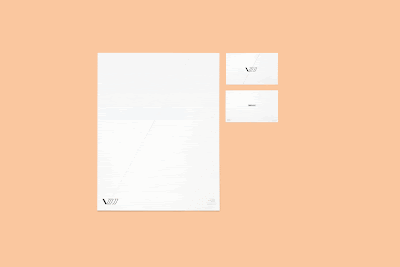
Also, for some brownie points I've put together some stationary so the project looks 'whole.'
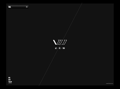
Draft of the site as it stands currently (without background media.) Small dropdown menu item which emcompasses the details "ALT-US-YOU." smaller details are kept tucked away in the lower left corner.
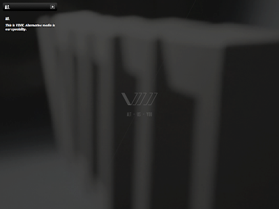
A shot of how the text under each menu item is displayed. Also the logo type is set back in transparency whilst the intro video plays, then fades back in as-well as darkens the whole site.
PDF Mailer.
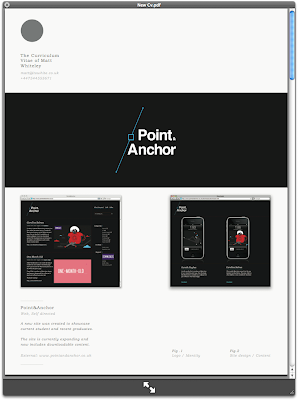
As of recent I've been working on a new c.v and pdf mailer. As we're coming into winter I'm aiming to get myself a work placement in Manchester. Will be sending out some emails early next week.
I'll keep you posted.
VINK alt.media
Current tech media project. Self directed brief to basically do what we want!
Anyway I've created an imaginary alt.media (film) company called VINK.
The visuals here are the results of my weekend of brainstorming and sketching and the digitals are more or less just an excuse to start mac'in things up and getting some nice results digitally.
I'm liking the logo as it is now...however its unreadable....Therefore I think it will animate into the word OR simply stay as it is and become a pictogram/icon graphic.
Second visual is simply a dummy web layout. The background image is taken from Flickr but will be replaced by a small promotional film I will create that will run in the background similar to wearegolden.
Letter B
Update on a current fun little project. Producing an alphabet just of crazy characters made from letters. Eventually I'm aiming to get the whole alphabet done.....
Site Re-design
Finally settled on a web design that im happy with. Nice clean, minimal site with a centre image showcasing the work, this of which scrolls horizontally.
Other nice touches include a flash logo which changes colours through a warm spectrum of pink and yellow. Aswell as small buttons to expand information and links on the project.
Site Launched
Point&Anchor has been wicked so far! Got 4000 hits in the first week. As far as Uni's going, things are getting pretty busy. Anyway, got quiet a list of blog features so far....
Happy days :)
Blog Feature
Things are getting close now, keep getting more and more work to do. Although I've had some amazing stuff being sent it to everythings gonna look VERY nice! In the mean time, keep an eye on the twitter as i'll be tweeting new posts through that.
The twitter for Point&Anchor is online. Getting it hyped up before its launch on 21st September.
Already had a great response from students and grads and already got loads of lovely content to get on there. Anyway, support my project by following me on twitter -here- OR even better, if you have some work you'd like to see featured on there, send it along to share@pointandanchor.co.uk
A-man
After working at my mac all day I decided to whip the pencil and paper out and 'sesh' the lightbox. Came up with a couple of character designs of which I'm aiming to print and frame as a set.
Site update
Quick post. Updated the front page of my portfolio earlier today, working around the clock on Point&Anchor, learning some new .php/css stuff etc so I can get things moving before I go back to university. Meanwhile my designs for DSR motoX team are still underdevelopment...i'll get some visuals on here when I can.
Point&Anchor
A quick promotional poster and logo design as part of a self written brief. Concept is web based of which i'll be working on over the next few days. Depending how things turn out it could develop into a live project, but lets just see how the third year of uni goes first :)
Oh and the logo's under-development.
Whats What.
Haven't posted in a while. Being at home over summer is draining my enthusiasm and getting me abit frustated in terms of being inspired. However, a steady amount of freelance work is keeping me in the loop and ticking me over until I get back to uni, move into the flat, and can get on with some PROPER work in a nicer environment.
Got a nice project of which im working on with a friend, news will be on here once we're up and running. Anywho, the image above is just the start of an illustration I was playing around with the other night, gonna work into it when I have abit of time.
Smart City Futures
Just completed the artwork for an events prospectus for Smart City Futures. Working with Gareth we devised a colour coded concept to contain all the information. Keeping things on the DL till its printed, which will be Monday 20th. This work will be the key to getting my new site up and running as the credentials of the job will drive traffic to the site.
For now, our fate is in the hands of the lovely people over at TEAM - Impression, Leeds.
Revisited
A variation of an old t-shirt design. Hopefully aiming to get some t designs printed in the next month or two. My portfolio is being redesigned at the moment following the completion of a recent job, I now have the time to get it sorted. Visit again next week and there should be some movement :)
Update/
Been extremely busy lately so just keep you upto date with what I'm cracking on with. Currently me and Gareth are working together on a freelance project which is going VERY well. Along with this I'm in the process of branding myself. So far my web design is being tinkered so as and when that is complete the site will be launched. Also this blog will be adapted in style with it as to link to my portfolio. In between this I'm busy updating and sprucing up bits of old work and making them presentable. One of which is a flash welcome screen for Sherburn Aero Club. The situ window will display an animation of the functionality of the website and aspects of its design, rather than having stills.
Back & Forth Web Finals/
Well in order to keep my tutor happy I changed the final website before hand in and entry for YCN. Basically just to further distinguish the difference between the two modes of my concept. The macbook shots below are from the final boards and show either home page. The display .gif is just something I did for fun to showcase a few more of the pages / content of the site.
Print work/
The results of a stint in photoshop last night. White space stemmed from a random self promo brainstorm of which the title related to my surname. The poster was just to see how messed up I could get my vision from staring at lines of different stroke and opacity. Gradually drifted away from what I intended to work on but banged some visuals out anyway.
Visual Practice/
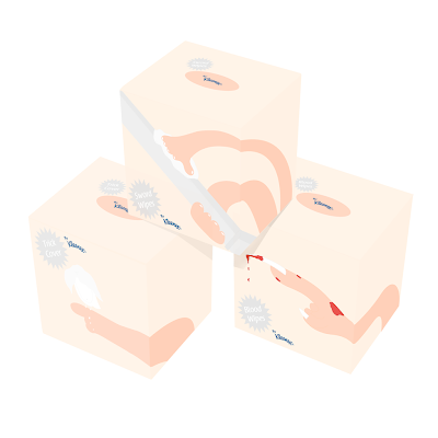
The first part of an ongoing visual practice brief. Some lighthearted illustrations have been put together to promote the tissues in ways other than specified. Three themes were chosen from a possible five, and the boxes were designed relevant to each chosen theme. The back of each box illustrates a step by step guide as to using each tissue for that method. The copyrighting is humorous and casually written in tone with the illustrative style.
Just a roughie/
Had a load of deadlines to meet recently so rather than letting my productivity slide I'm gonna keep busy by doing little bits and pieces under my own steam. Now its the easter break too so I'm determined to get some kind of draft illustration together of which I can paint on the soft pod (communal area) wall in uni.
Back & forth YCN entry/
Well after an all nighter on Sunday, and the amends i did at 6am this morning, the boards for YCN are done. Rather than the shocking university print facilities letting the final result down somewhat I was surprised at the quality of the prints. Using a relatively old looking Epson A2 printer on some thick matte stock I got a nice strong clean print. Anyway waiting around in the print queue and rolling around in the mac suite I decided to go for a coffee. My first experience in the "yours" cafe on campus as well, surprised to say its crackin'.
Note: Sorry for the image res, straight off the camera like.
Subscribe to:
Posts (Atom)